Friday, 8 February 2013

EVALUATION


Q1. IN WHAT WAYS DOES YOUR MEDIA PRODUCT USE, DEVELOP OR CHALLENGE FORMS AND CONVENTIONS OF REAL MEDIA PRODUCTS?


Q2. HOW EFFECTIVE IS THE COMBINATION OF YOUR MAIN AND ANCILLARY TEXTS?


Q3. WHAT HAVE YOU LEARNT FROM YOUR AUDIENCE FEEDBACK?


Through audience feedback we have been able to evaluate the effectiveness of our music video by showing it to our potential target audience. The audience feedback that we received allowed us to see what we did well as well as also giving us an indication on where we could have improved it and what would have made it more effective. In our audience feedback the audience said that ‘the reflector gave a good effect’ as well as the use of ‘good lighting, as it gives a dynamic feel.’ We wanted to concentrate on lighting the subject so that it creates a ‘glamorous’ appearance as well as maintaining a ‘moody’ and mysterious atmosphere. 


The audience also commented on the jump cuts by saying that there were ‘good jump cuts, especially with the photographs.’ In doing this, we really wanted to maintain the fast pace of edit with the short shot duration so that we could create a relationship between the visuals and the song. 


However, we did receive some points that we could have improved on such as, ‘you can tell that Shqipdon wasn’t playing the guitar.’ This would have made our music video slightly more effective if Shqipdon was actually playing the guitar. Although, this wasn't entirely possible as Shqipdon didn't know the music to the song well enough so that he could play it. However, a slightly more realistic or believable performance may have just enhanced enough so that it looked slightly more effective. 


In the feedback we found that there was good use of camera movement; however, the rule of thirds doesn't always seem to work. This is something that we could have considered more in the filming process of our music video. If we could redo our project this is definitely something that we could consider as this would have given a more professional look as the rule of thirds are important within the stages of filming. 

Our audience feedback has made us think about what makes a music video effective and professional by just taking in to consideration different techniques within the filming and editing stages. Our main concern was trying to convey the narrative so that it was easy for the audience to follow and understand and this was key because it was both narrative and performance based as well as having a fragmented narrative and from the audience feedback we found that we have achieved this through the comments that we received.


Our main concern was trying to convey the narrative so that it was easy for the audience to follow and understand and this was key because it was both narrative and performance based as well as having a fragmented narrative and from the audience feedback we found that we have achieved this through the comments that we received. 


Q4. HOW DID YOU USE MEDIA TECHNOLOGIES IN THE RESEARCH AND PLANNING, CONSTRUCTION AND EVALUATION STAGES?

Wednesday, 6 February 2013

OUR DIGIPAK


For our digipak we wanted to create a digipak that focused on the idea of star image. We wanted to use images that created a more three dimensional artist, so it gives a slight insight into what our artist is like. We really like how we created our digipak as two of the black and white images are in a corner and so they are diagonal from each other. I think that these images slightly relate to the one found on Adele’s ‘21’ album as the images are quite subtle rather than being quite bold and in your face. They also appear quite ‘glamorous’ as well as having a slight ‘moody’ and mysterious atmosphere to them. We used the same font throughout our digipak and so we have maintained the continuity. This use of atmosphere makes Shqipdon look quite emotional and so there is a slight link with the music video.


Saturday, 26 January 2013

OUR MUSIC VIDEO

OUR MAGAZINE ADVERTISEMENT


For our magazine advertisement we wanted to focus on the star image and so we decided to use an image of Shqipdon with a guitar. The use of a guitar also provides iconography and so it gives an indication on the genre and style of the music. For the star image we used soft lighting and also increased the saturation so that the image will appear ‘flawless’ and quite ‘glamorous’. For the text we decided on a font that was easy to read and similar to the one found on Ghostlight’s album and Ep. We also kept the font the same running through our ancillary texts so that there was a sense of continuity. On our advertisement we incorporated the band’s website so that we included methods of promotion. We also used logos for social networking sites such as ‘Twitter’, ‘Facebook’ and ‘MySpace’ so that it promoted the band as well as providing some methods of consumption for audiences. On the band’s website we found recommendations and quotes from critics about the band’s album and included them within our poster so that this provided us with another method of promotion for the band. In order to promote our digipak we put an image of it onto our magazine advertisement as the image we used was different from the one on our digipak. We did this so we created a different star image as well as incorporating the use of iconography.
 

Wednesday, 16 January 2013

SOCIAL NETWORKING SITES


In our magazine advertisement we have included some social networking sites such as ‘Twitter’, ‘Facebook’ and ‘MySpace’. This promotes the artists as they are appearing more connected to their audiences. Social networking sites are good places for artists and institutions to distribute music so that consumers can listen to or download the artist’s music. So we have decided to include these in our magazine advertisement as we wanted to show other ways of how our artist was going to be marketed and promoted.

Thursday, 10 January 2013

MAGAZINE ADVERTISEMENTS


GWEN STEFANI - LOVE. ANGEL. MUSIC. BABY

This magazine advertisement focuses on the star image as it gives a ‘glamorous’ appearance through high key lighting, this gives a ‘flawless’ look which is typical of the pop or R‘n’B genre. There is a form of continuity running through the magazine advertisement and the album cover as the poster uses the same image that is found on the album but it has been zoomed in on. The star image also helps to promote the artist’s iconography as the crown and blonde hair is what makes her recognisable to audiences. The album also looks closely at album promotion as the album covers the whole of the background as well as having a small image of the album in the bottom left hand corner. There is form of continuity which helps to promote the artist as the same font has been used in both the magazine advertisement and the album cover. The advertisement provides information such as the artist’s name, album title, songs included, record company and also the website. This promotes the album as it gives audiences lots of information about the album so that audience can recognise her by her songs and also the website. The image on the advertisement and also the album cover provides a glamorous appearance and also creates voyeuristic treatment as well as sexualisation through the positioning and also the camera. There is also the idea on focus on looking as only one of her eyes can be seen meanwhile the other is being hidden by the artist’s hair.

YOU ME AT SIX – HOLD ME DOWN

The magazine advertisement for You Me At Six’s album ‘Hold Me Down’ also has the album artwork for the image of the poster. There is a strong sense of continuity running through the album cover and magazine advertisement. As the album cover has been used in this poster it means that the fonts are the same as well as the image in the background. The bold font stands out and so it promotes the album and that the album is ‘out now’. The font of the band’s name differs from that of the album’s name and so this allows the audience to differentiate from one another and so the audience are most likely to remember the band their album. The poster is both colourful and eye catching and so this gives a suggestion to the genre and also what the style of music the band creates. This magazine article contrasts Gwen Stefani’s magazine advertisement as it doesn’t have a star image or a band signature and so this could give a suggestion to the genre of the band. Another indication to the genre is the graphic image which has a ‘grungy’ and ‘punk’ look.


By looking at these magazine advertisements I have found that promoting the album is the focus of a magazine advertisement. I think that for some genres such as pop and RnB focus a lot of the promotion of the artist and also the star image where genres such as rock and pop often look at either band signature or graphic images such as the one on the album of the You Me At Six’ album.


PHOTOS USED WITHIN OUR DIGIPAK

 
The photos that we have used in our digipak focus on the star image which slightly subverts the typical conventions of the indie genre. However, we wanted to closely relate it to our music video and so we thought that the best way to do this was to continue the idea of having the star image.

We have chosen this image as it provides iconography because the guitar gives a suggestion to the genre. It also gives an idea of what the style of music the artist plays. This helps to promote the artist as it provides a star image as well as an indication to the genre and style of music. We really liked this photo in colour as it adds to the ‘glamorous’ appearance.


We also wanted to give a star image that looked quite glamorous yet casual at the same time. So we decided on having Shqipdon sorting out his shirt so that it makes him appear three-dimensional and so audiences see a different side to the artist. We also thought that having it in colour would make him appear more ‘glamorous’.


During the photoshoot we wanted to experiment with different poses and so we thought that by having Shqipdon pushing his hair back it suggests a sad atmosphere because his facial expression is quite sad. The fact that the image is in black and white it adds to the sad mood and atmosphere.
 
We wanted to use a close up shot within our digpak and so we decided to use this photo as it shows the use of soft lighting which creates a ‘flawless’ and ‘glamorous’ appearance and so by having this image in black and white it adds to the ‘glamorous’ appearance. 


We thought that by using a shot of Polariods it would link with the title of the song and also the title of the album. It also creates a subtle star image as there is an image of Shqipdon on it


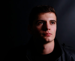
We really liked this photo as there is lots of soft and light key lighting, however there are lots of shadows that cover the side of the face and so it creates quite a mysterious and sad atmosphere.


I like how the subject doesn’t address the camera and so there is no eye contact. This suggests a mysterious and sad atmosphere as they appear quite secretive. I also really like how we have used star image as the focus of our digipak because we have been able to create a sad atmosphere that also runs through our music video.