The
photos that we have used in our digipak focus on the star image which slightly
subverts the typical conventions of the indie genre. However, we wanted to
closely relate it to our music video and so we thought that the best way to do
this was to continue the idea of having the star image.
 We have
chosen this image as it provides iconography because the guitar gives a suggestion
to the genre. It also gives an idea of what the style of music the artist plays.
This helps to promote the artist as it provides a star image as well as an
indication to the genre and style of music. We really liked this photo in
colour as it adds to the ‘glamorous’ appearance.
We also wanted to give a star image that looked quite glamorous yet casual at the same time. So we decided on having Shqipdon sorting out his shirt so that it makes him appear three-dimensional and so audiences see a different side to the artist. We also thought that having it in colour would make him appear more ‘glamorous’.

During the photoshoot we wanted to experiment with different poses and so we thought that by having Shqipdon pushing his hair back it suggests a sad atmosphere because his facial expression is quite sad. The fact that the image is in black and white it adds to the sad mood and atmosphere.
We
wanted to use a close up shot within our digpak and so we decided to use this
photo as it shows the use of soft lighting which creates a ‘flawless’ and ‘glamorous’
appearance and so by having this image in black and white it adds to the ‘glamorous’
appearance.
 We
thought that by using a shot of Polariods it would link with the title of the song
and also the title of the album. It also creates a subtle star image as there
is an image of Shqipdon on it
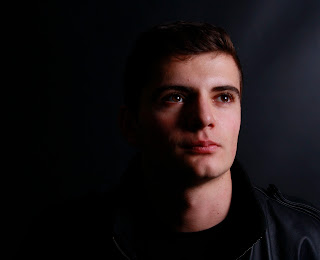
We really
liked this photo as there is lots of soft and light key lighting, however there
are lots of shadows that cover the side of the face and so it creates quite a mysterious
and sad atmosphere.
I like
how the subject doesn’t address the camera and so there is no eye contact. This
suggests a mysterious and sad atmosphere as they appear quite secretive. I also
really like how we have used star image as the focus of our digipak because we
have been able to create a sad atmosphere that also runs through our
music video.


No comments:
Post a Comment